The tech giants, such as Google and Apple, have a way of keeping everyone on their toes. In this fleeting mobile market, it can be difficult to stay current with new technology trends. Instead of tearing out your hair in frustration with the everchanging policies of the digital world, let the experts at BPetersonDesign be your guide. As an innovative website design, digital marketing, and graphic design company, we tune into the unveiling of modern technology systems. Most recently, Google launched a new mobile-first indexing practice that is shaping the way the search engine processes content. In this article, we’ll lay the foundation to mobile-first indexing, establish the significance of a responsive website, and provide solutions for your website development needs.
Mobile-First Indexing

Essentially, Google just changed how content is categorized and added to its index. The reason? This global search engine expert is rolling with the mobile market and accommodating the rise of the smartphone. It seems that more and more people are reaching for their smartphones, rather than turning on their desktops. While the desktop is not deemed obsolete as of yet, mobile technology is taking over. On average, roughly 77% of mobile searches occur at either home or work, while 17% of searches happen on the go. Which means that consumers are plugged in. Let’s face it, the mobile device is how people are choosing to interact with the online web.
As a result, Google is using the mobile version of your website as the starting point for indexing. As they crawl about your content, Google is searching for relevant, fresh text and keywords. Indexing and crawling are important for website owners, for it can impact your ranking. Many of our competitors will scrape information (steal content) from similar sites, making your website cliché. Not only is this type of website uninspiring, it’s not likely to rank well on Google. However, content is not the only factor that will hurt your ranking. If your website is not mobile-friendly, then kiss your chances of being on the first page of a search query goodbye. For best organic growth, let Google find you. That’s why at BPetersonDesign, we use responsive design techniques with our websites.
Responsive Web Design

Thankfully, with newer technology, a lot of trial and error, and the rise of smartphones, website development is a little easier for the webmasters of BPetersonDesign. Long gone are the days of creating two sites. Instead, the team at BPetersonDesign emphasizes responsive design techniques to maximize your mobile experience.
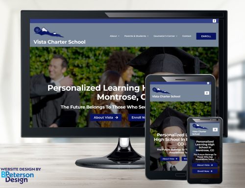
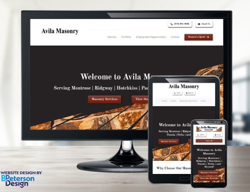
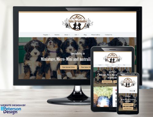
What is responsive design, exactly? If you recall from one of our earlier blogs, “What is a Responsive Website and Why Do I Need One?,” we cover the basics of responsive design and how it can affect your Google ranking. Just to recap, responsive design should automatically adjust the resolution, the image size, and scripting abilities to any mobile device. In order to do this, the webmasters at BPetersonDesign construct flexible grids and layouts that are conducive to a variety of digital platforms. Go ahead, give our site a test. If you have a desktop, a laptop, and a smartphone, then load our site in all three platforms. You’ll see instantly what we mean with responsive design. All the features of the website should be compatible with your mobile device. While many third-party website design platforms provide responsive design templates, BPetersonDesign custom creates your website from the ground up.
Ahead of the Curve

Even though Google rolled out the mobile-first indexing in March of 2018, you could say that BPetersonDesign was ahead of the curve. You see, when this new sorting system launched, many web designers were panicking about server performance. BPetersonDesign smiled. We’ve always prioritized responsive web design, and because of it, we have a history of gaining organic growth for our clients. Although mobile-first indexing doesn’t directly affect your SEO analytics on Google, it indirectly impacts it through the crawling and indexing. If you don’t have a mobile-friendly site, contact us today for a free initial consultation. We provide a full spectrum of additional features for your company, such as management systems and shopping carts. Our in-house development team provides maintenance packages, so you don’t have to worry about the day-to-day upkeep.
BPetersonDesign is located in Montrose, Colorado and Cave Creek, Arizona. While we proudly serve our local community, we also provide web design and digital marketing to all 50 states. Let us worry about the SEO index and mobile-first indexing. You focus on what you love to do: Your business.


